Plotting#
Doing data analysis is one thing, but being able to visualize your data is another. In this session, we will learn how to plot data using the matplotlib library.
The whole plotting logic is really similar to the one in MATLAB, so we all should feel at home.
plot()#
With matplotlib, we can create a simple plot by using the plot function. This function receives two arguments: the x-axis and the y-axis values.
IMPORTANT: The plot is not shown until we call the show function. This is really useful when we want to plot multiple graphs in the same figure. Contrary to MATLAB we don’t need to use the hold on command.
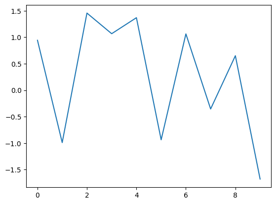
We can either give the plot function one argument (the y-axis values) or two arguments (the x-axis and the y-axis values).
import matplotlib.pyplot as plt
import numpy as np

y = np.random.randn(10)
plt.plot(y)
#the important part is that the plot is not shown until we call the `show` function
plt.show()
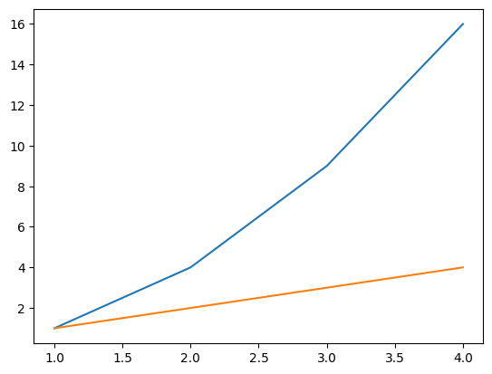
To add multiple lines, we can just call the plot() function multiple times.
x = [1, 2, 3, 4]
y1 = [1, 4, 9, 16]
y2 = [1, 2, 3, 4]

plt.plot(x, y1)
plt.plot(x, y2)
plt.show()
hist()#
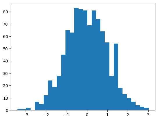
Another really useful function is the hist function. This function receives a list of values and a number of bins. This is especially useful to inspect the distribution of a variable.
import numpy as np
data = np.random.randn(1000)
plt.hist(data, bins=30) #using the bins keyword we can specify the number of bins
#in MATLAB we learned to parametrize functions using function(..., 'param', value, ...) -- here we use the keyword arguments and an equal sign
plt.show()
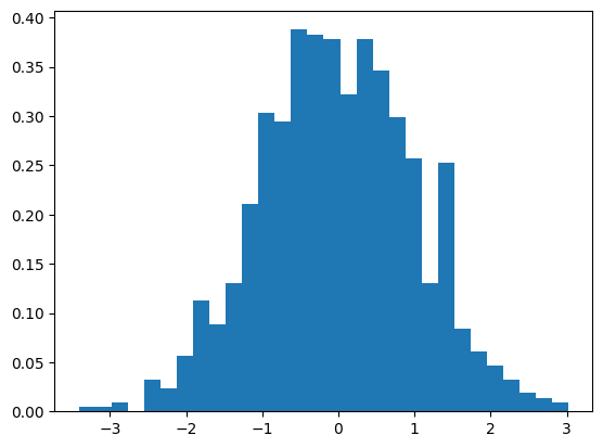
Having our y-values as the density instead of frequency is really useful. We can use the density parameter to normalize the histogram.
plt.hist(data, bins=30, density=True) #see how the y-axis is normalized (all bins sum up to 1)
plt.show()
scatter()#
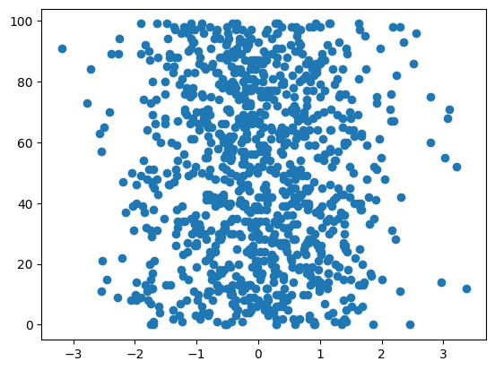
The scatter function is used to plot points. It receives two arguments: the x-axis and the y-axis values.
x = np.random.randn(1000)
y = np.random.randint(100, size=1000)
#IMPORTANT: here we see the importance of the order of the arguments -- parameter 1 in randn is the number of samples, while in randint is the upper limit of the range
#this is a common source of errors, so be careful
#to be save, you can always use the keyword arguments or check the documentation

plt.scatter(x, y)
plt.show()
bar()#
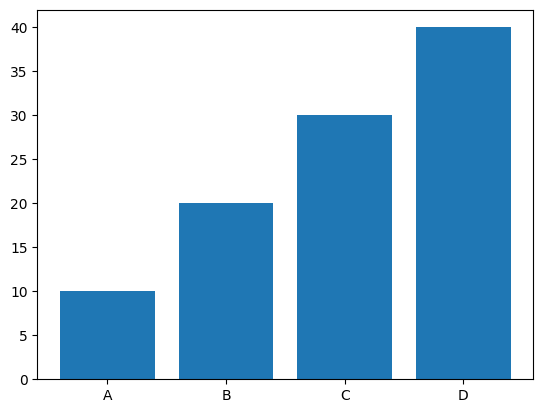
The bar function is used to plot bar charts. It receives two arguments: the x-axis and the y-axis values.
x = ['A', 'B', 'C', 'D']
y = [10, 20, 30, 40]

plt.bar(x, y)
plt.show()
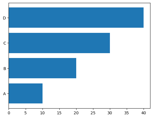
We can also plot horizontal bars. The important part is that the x-axis and y-axis values stay the same, even though the bars are horizontal and the labels are on the y-axis.
plt.barh(x, y)
plt.show()
imshow()#
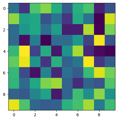
The imshow function is used to plot heatmaps. It can receive a matrix (a 2d array) as an argument.
matrix = np.random.rand(10, 10)

plt.imshow(matrix)
plt.show()
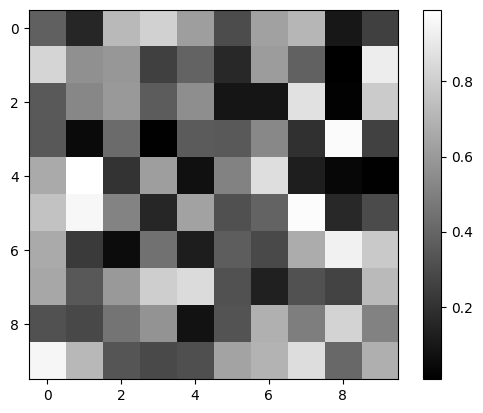
This of course doesn’t help us much, and we can’t really interpret the values of the matrix. We can add a colorbar to the plot to help us understand the values by adding plt.colorbar() before showing the plot. And we can also change the colormap (what magnitude colors correspond to).
See also: https://matplotlib.org/stable/tutorials/colors/colormaps.html
A common colormap is the gray colormap.
plt.imshow(matrix, cmap='gray')
plt.colorbar()
plt.show()
Reading Images#
We can also read images using the imread function. This function receives the path to the image as an argument and returns an array with the image data.
img = plt.imread('dataCourse/bumblebae.jpg')
plt.imshow(img)
plt.show()
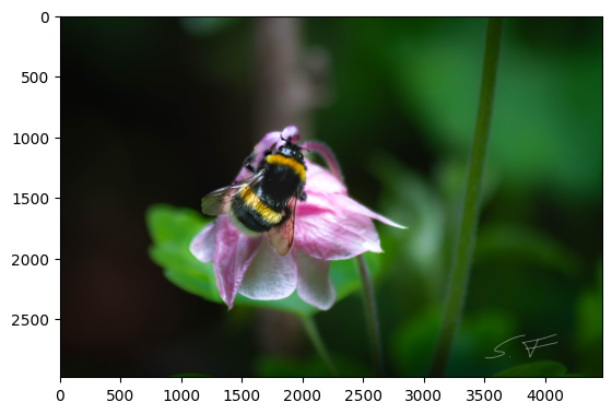
Take a look at the shape of our image:
print(img.shape)
(2981, 4471, 3)
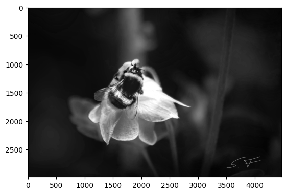
The image is a 3d array, where the first two dimensions are the height and width of the image, and the third dimension is the color channels (RGB). We can also select different channels of the image. For example, to select the red channel, we can use the following code:
plt.imshow(img[:, :, 0], cmap='gray')
plt.show()
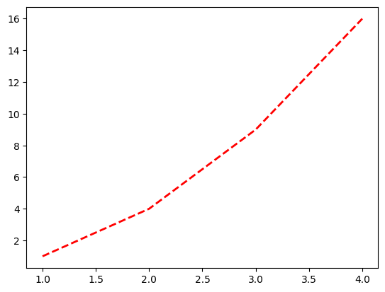
Styling Plots#
We can change the style of the plot itself by adding arguments to our plot functions.
x = [1, 2, 3, 4]
y = [1, 4, 9, 16]

plt.plot(x, y, color='red', linestyle='dashed', linewidth=2)
plt.show()
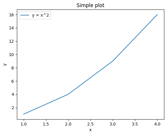
We can also add labels to the axes and a title to the plot, add a label to the plot itself and change the size of the plot.
#to change the size of the plot, we can use the following function
plt.figure(figsize=(10, 5)) # NOTE: this has to be called before the plot function, otherwise no effect
#to add a label and later a legend to a plot, we need to add the label argument to the plot function.
plt.plot(x, y, label='y = x^2')
#to add that plot-label, we need to call the following function
plt.legend()
#to label the axes and add a title, we can use the following functions
plt.xlabel('x')
plt.ylabel('y')
plt.title('Simple plot')
plt.show()
<Figure size 1000x500 with 0 Axes>
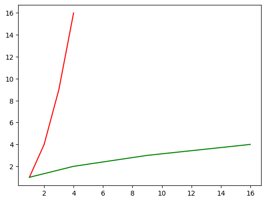
Handles#
We can also get handles to the plots we create. This is useful when we want to change the properties of the plot after we have created it.
plot1, = plt.plot(x, y)
plot2, = plt.plot(y, x)
#we can change the color of the plot by using the set_color function
plot1.set_color('red')
plot2.set_color('green')
plt.show()
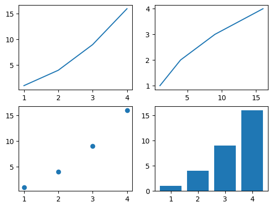
subplots() and fig#
We can also create multiple plots in the same figure. We can do this by using the subplot function. This function receives two arguments: the number of rows and the number of columns of the grid of plots.
fig = plt.figure()
#we can create a 2x2 grid of plots
axs = fig.subplots(2, 2)
#the axs variable is a 2d array of axes on which we can plot
axs[0, 0].plot(x, y)
axs[0, 1].plot(y, x)
axs[1, 0].scatter(x, y)
axs[1, 1].bar(x, y)
plt.show()